
✦
P R O J E C T O V E R V I E W
Role:
Lead UX/UI Designer
Timeframe:
3 weeks
Team:
Laura Cecilia, Courtney Estes, Gabriel Geissler
Tools:
Figma, Figjam
NCLEX High Yield—a test prep company dedicated to helping prospective nurses prepare for and pass their licensing exam—faced a significant challenge: their rapid growth had outpaced their ability to address usability issues as they expanded, resulting in a disjointed platform with unclear functionality and inconsistent UI. Users felt that basic tasks such as booking a tutoring session, exploring course options, or accessing review materials involved too many steps, leaving them frustrated at being unable to find what they needed.
This case study will walk through our three-week design process, focusing on how we simplified their navigation, unified their user interface, and highlighted their strengths to create a seamless and impactful user experience.
NCLEX High Yield User
✦
T H E C H A L L E N G E
Something that immediately stuck out to us was the separation of their main site, hosted on Shopify, from their "on-demand" course site, hosted on Teachable.
Having to navigate between the two sites felt potentially confusing—the navigation changes at least three times as you click through each page—and even when users did make it onto their intended page; we suspected that their cluttered, poorly structured information further complicated the experience.

No visual hierarchy in copy; everything feels like a priority

Important information embedded in images
✦
R E S E A R C H
To validate our hypotheses, our team set out to understand NCLEX High Yield's users' struggles, goals, and expectations directly.
We conducted:
✽
6 usability tests
✽
8 survey responses
✽
Heuristic evaluation
✽
Competitor analysis
Key findings:
Disjointed navigation
Users felt that constantly switching between the Shopify and Teachable sites created a disjointed experience, made more frustrating by the lack of consistency in menu items.
"The two sites get confusing because I never know where I am."
Difficulty finding information
Users struggled to find course details and resources due to poor labeling and inconsistent naming conventions (e.g., "on-demand lectures" vs. "self-paced course")
"This was so hard to find—I had to click through so much stuff."
Unclear value proposition
Important information was poorly structured, making it harder for users, many of whom spoke English as a second language, to understand the products' value.
"I just don’t understand what the course entails. Is this just regular test-taking strategies?"
Accessing course materials
Many users couldn’t find the login page, since it was only available through the course site, which people might not know how to get to.
"I had to Google ‘NCLEX High Yield login’ to find it."
SWOT Analysis:
Strengths
✽
People love Dr. Zeeshan—most of the users we interviewed mentioned his teaching style.
✽
NCLEX High Yield feels more personable and relatable than other major test prep competitors on the market, and users agree.
✽
Approachable methods that work. A majority of NCLEX High Yield's users are coming as repeat test takers and non-native English speakers—both demographics which Dr. Zeeshan himself fits.
Weaknesses
✽
Limitations within their chosen platforms (Shopify & Teachable)—a lot of manual tasks that pile up.
✽
Visual design lacks cohesion, which can potentially be brand damaging.
Opportunities
✽
Optimize site maps and user flows for more seamless navigation across both sites and reduce unneccessary steps for task completion.
✽
Update UI across all touchpoints for a more unified, cohesive look that enhances brand credibility.
✽
Optimize content strategy into a more digestible, easy-to-understand format.
Threats
✽
Poor information architecture—tasks take too long to complete.
✽
Lack of visual hierarchy in the way information is presented, making content overwhelming and difficult to scan.
✽
Lots of broken links leading to 404 Error pages.
✦
S T R A T E G Y
With only three weeks to complete this sprint, we had to prioritize; there were simply too many directions we could go in. While it was tempting to design the most gorgeous, optimal solution that fixed all of their issues in the mythical land of our figma document—our client told us they wanted to "see what was possible," essentially giving us free reign to explore ideal solutions without taking into account technological constraints—we felt there was a balance to be struck.
The separation of their main site from their on-demand course site was likely something they would not be able to migrate away from anytime soon, given the significant time, money, and effort required to build a custom solution. So, our challenge became designing a solution that both worked for their current tech stack, but was still flexible enough to go with them into the future.
We landed on three deliverables:
01
A detailed sitemap to streamline navigation across the two sites.
02
Wireframes for key pages, demonstrating examples for modular layouts.
03
A custom, flexible design system to use across all their platforms.
✦
N A V I G A T I O N
I spent a substantial amount of time on the navigation, as it was clear that it was one of NCLEX High Yield's biggest pain points. First, I started with mapping out their current Site Map and comparing it against major competitors to come up with a preliminary Site Map. Then, I consulted insights from our surveys and usability tests to revise and finalize.
✽
See below for the before and after!


Current Navigation

✦
I D E A T I O N
After working out the navigation, it was time to get to designing. I like to start with sketching on my tablet and a notes app to quickly get ideas out and work out general layouts. These also serve as a visual checklist for me to work out what elements I need to design out in my final designs.
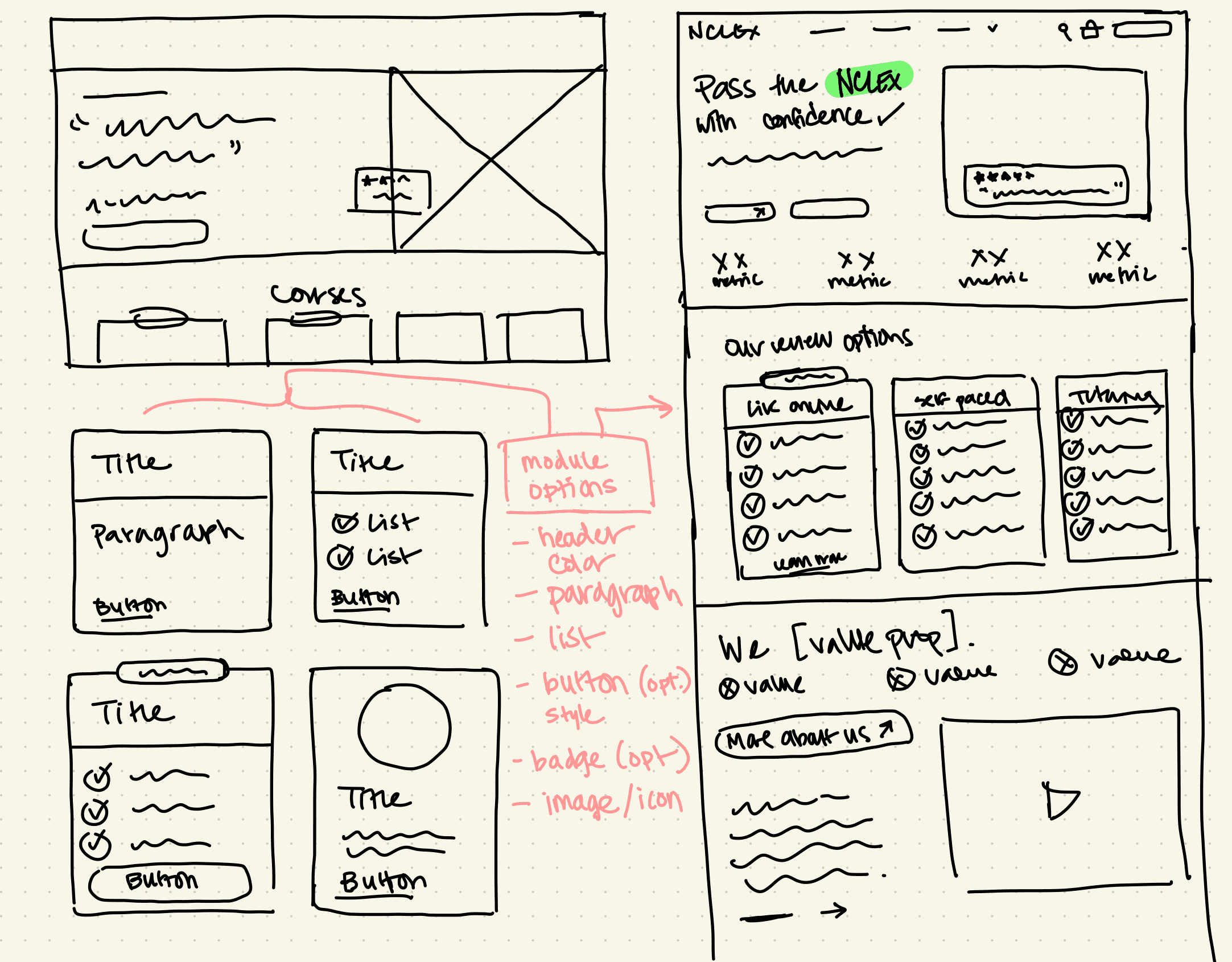
Home Page Sketch

"All Courses" PLP Sketch

Live Course PDP Sketch

Events & Resources Page Sketch

Final, High Fidelity Wireframes
✦
F I N A L D E S I G N
The design system:
✽
Each section is designed as a module, aligning with Shopify’s theme builder for seamless integration with Shopify’s CMS.
✽
Modules designed with multiple use-cases in mind to support flexibility for future teams managing the site’s content.
✽
Wireframes are intended to demonstrate potential page layouts and do not represent the final live product.

