
✦
P R O J E C T O V E R V I E W
Role:
Lead UX/UI Designer
Timeframe:
3 weeks
Team:
Laura Cecilia, India Cross, Soojung Choi
Tools:
Figma, Figjam
As part of a 3-week design sprint for General Assembly's UX Design Bootcamp, our team was tasked with creating a digital platform for the StreetSmARTs Program, a partnership by the San Francisco Arts Commission and Public Works that pairs artists with property owners who have received Notices of Violation for the removal of graffiti on their buildings. The program offers property owners the opportunity to opt into the program for a fixed fee, at which point SFAC staff will work with them to select an artist to create a mural at their site.
Although their program currently only focuses on property owners who've received the violations, we were asked to help build a solution that would expand the program's reach and provide wider digital access to its artists as well as the murals that abound the city.
Elsa Mosquera, community organizer
✦
R E S E A R C H
Before we could start ideating, we first had to understand the problem space. There were so many questions for us to consider: how could StreetSmARTs effectively connect artists with private property owners? Were there sites or apps currently in existence that did something similar? How do artists go about finding mural jobs? What permits do artists need in order to prepare for an installation? How do we ensure fair compensation? What even motivates property owners to seek out street artists? What motivates artists to paint on this large a scale? How do community members find street art to enjoy?
To find out, we conducted:
✽
6 interviews—including 3 muralists and 2 community organizers
✽
A competitor analysis of 4 programs similar to StreetSmARTs, and freelance gig sites like Fiverr and Task Rabbit
We identified three potential users:
✽
Seek fair compensation and clear communication about project requirements.
✽
Value showcasing and getting credited for their work to attract future clients.
✽
Motivated by neighborhood beautification, increasing area foot traffic, deterring vandalism, supporting local artists.
✽
Concerned with unclear pricing
✽
Interested in finding murals and engaging with public art, but lack the accessible tools to do so.
Given the three-week time limit, however, we knew we had to limit our scope and focus designing our MVP around one primary user.
While most platforms that sell freelance services (e.g. Fiverr, Task Rabbit) tend to cater their experience towards those doing the hiring, we recognized that artists at the true beating heart of this program. Without them, property owners and community members wouldn't have a reason to engage with the platform, so it made sense to us to center artists in the app's design—and we happened to have the most information on them.
Meet Jasmine, the aspiring full-time muralist.

Bio
Recently relocated, with a demanding job as a full-time waitress and part-time muralist, Jasmine aims to streamline her mural art business. She wants to find effective strategies to connect with potential clients in her city and secure consistent commissions.
Goals
✽
Connect with local clients for art commissions
✽
Collaborate with clients to transform their visions into stunning murals
✽
Inspire and transform public spaces and reach a larger audience around her city
✽
Attract potential clients and grow her network
Frustrations
✽
Clients offering low budgets that don't cover materials, labor and overhead
✽
Inconsistency with client communication during project
✽
Determining accurate project timelines
✽
Clients having unclear or unrealistic expectations
✽
Having trouble finding legitimate opportunities
Her journey map

✦
I D E A T I O N
Once we had settled on our primary user, it was time to start the fun part—ideating. One thing we knew we wanted to do was expand the program's reach to beyond San Francisco and take it nationwide. Outside of that, however, there were many potential directions we could take the app in, but one key question continued to plague us: how much focus should we place on community? We felt strongly that the community needed to have a prominent presence in the product. Art thrives in community, and this felt especially true for murals, as they not only serve as a reflection of the spaces and cultures they inhabit. Unlike books, movies, or theater, murals cannot be selectively engaged with—communities must live with these artworks every day. This makes it essential for murals to resonate with the people and spaces they represent.
Unfortunately, we also knew that with the time constraints on the project, we had to prioritize carefully. A feature that facilitated connections between property owners and artists was the primary focus and core component of the app. So the challenge became: how could we integrate the community meaningfully into that flow without compromising the primary functionality?
User stories
To prioritize, we each crafted user stories, which we then organized into actionable tasks and epics. From there, we worked out which features were most essential for our MVP.
TL;DR—we decided to prioritize the following features:
Sketching & wireframing
Finally, it was time to get to designing. I like to start with sketching in a notes app on my tablet to quickly get ideas out and work out general layouts.
For this project, there were just so many features and ideas that I felt that doing this step before working out user flows was ideal, so I could visually work out what screens and steps might be required to complete a task.
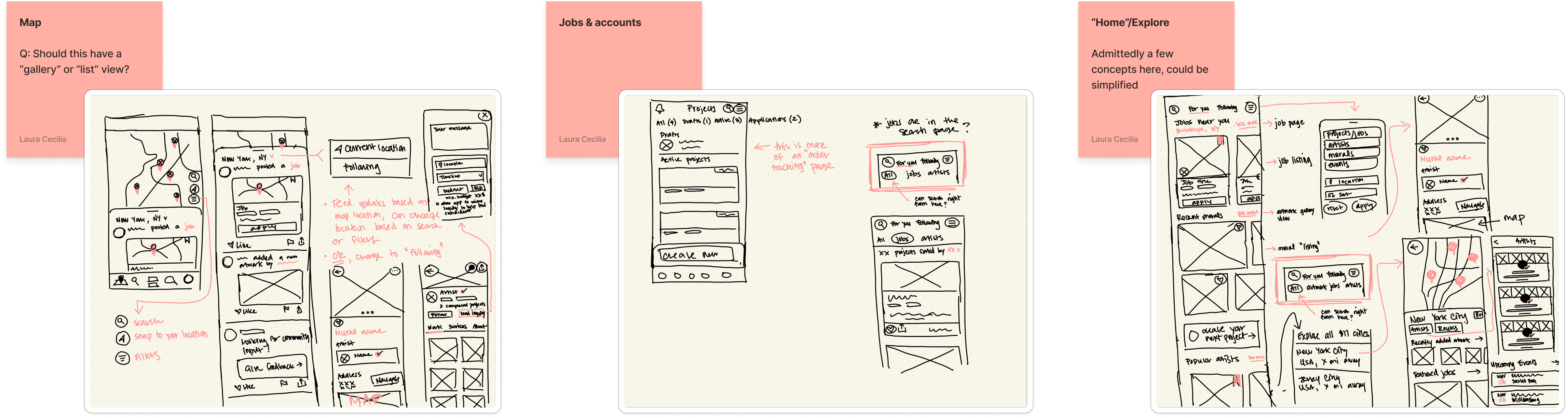
My preliminary sketches
✦
F I N A L D E S I G N
In terms of visual design, I went with red as the app's primary brand color. While red can often feel harsh or suggest danger, I selected a warm, almost pinkish hue to convey vibrancy and life, aligning with the energy murals bring to communities. The rest of the app's design is intentionally simple, utilizing white backgrounds to allow the art itself to shine through and bring color to the interface. This ensured the focus remained on the murals and their artists.
Discover mural projects near you
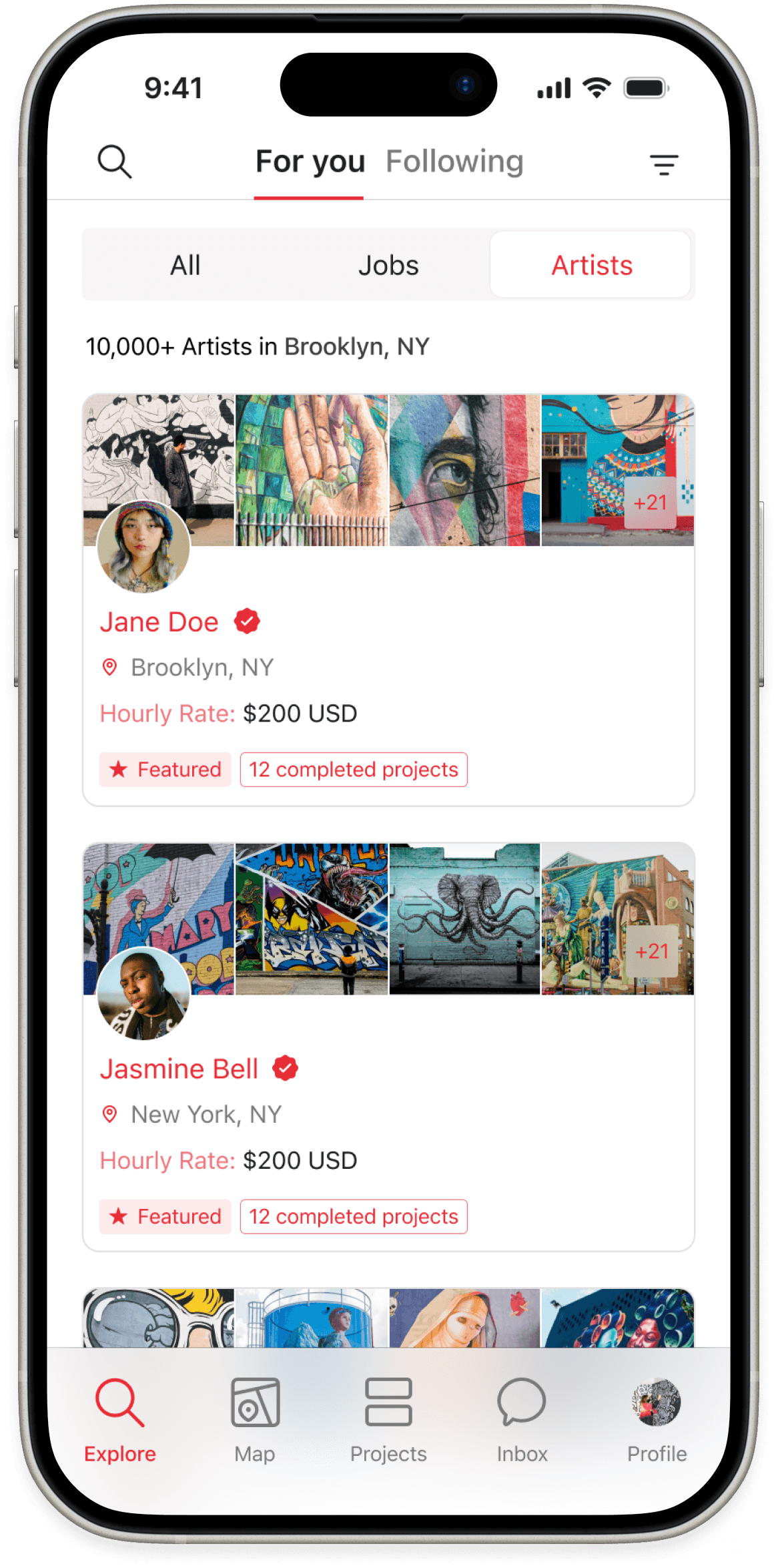
Explore local artists & view their work

Connect with artists directly

Find murals around your city
Usability testing:
Using our prototype, we were able to conduct usability tests with three potential users. Here's what we found:


Artist profiles: before & after


Job listings: before & after
Artist profiles
Users felt that our initial artist profile design lacked appropriate context and information up front. They wanted to see more about the artist and who they were so they could put the artists' work into context. Most testers also mentioned wanting reviews or testimonials visible on their profile page. As a result, we reworked the artist profile's header to include these things.
Laura's note:
Artist reviews in the profile were always part of the plan, but they didn't make it into our final design as we raced to prepare for the first usability test. Hearing this feedback from users was the perfect opportunity to pause and incorporate them.
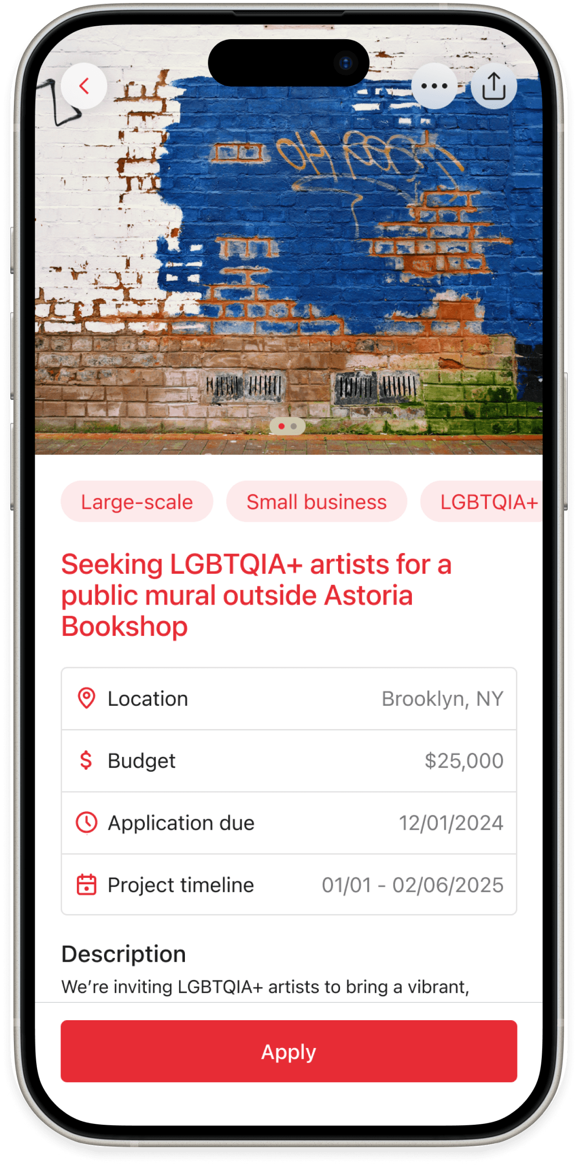
Job listings
There was also some concern about the lack of context on the job listing pages. Testers expressed wanting a way to quickly get an understanding of the type of project it was up front before deciding if they wanted to delve deeper into the project details.
To address these concerns, we added "context tags" at the top of the listing, and put the most important details such as location, budget, application deadline, and project timeline in a list at the top.
Laura's note:
In a V2, I would love to rework the listing cards to include these tags as well, so users can get this information before even clicking into the page.
Map purpose
There was a fair amount of confusion over the map as a whole. Users were confused about what exactly the map was showing them—whether it was already completed murals, job opportunities, ongoing mural installations, etc. They were also unsure about the attached newsfeed, and how it updated.
Unfortunately, this problem was a little too complex to fix within the given sprint, but ways we think we could tackle some of these concerns in a later version is to develop a color tagging system to better attribute the kinds of pins being shown, as well as improve how the filtering is displayed to make it more immediately apparent what types of pins the map shows.
Laura's note:
Out of all the features, the map was the one I was most excited about—ultimately, for this version, I didn't quite have enough time to flesh out all the ideas I had for this feature in the given time frame, making the overall intention of the feature seem a bit unclear.
Overall usability
Overall, all of our testers expressed interest in the app, saying that there weren't really platforms like this currently on the market. Most of this type of work is found entirely through word of mouth, so a product like this would be extremely useful in their day-to-day life, and they would recommend others in the scene adopt it.
All our users also mentioned that for the most part, the interface was fairly straightforward and easy to use and understand.
Laura's note:
Generally quite pleased with how the app came out given our time constraints, but there's so much I was left wanting to explore...